We know diet is important to human health.
Across the world, around 800 million people are undernourished —going hungry because they do not have access to enough food to meet their daily needs—while more than 2 billion people are deficient in essential vitamins or minerals (known as ‘hidden hunger’) and around 1.9 billion adults are overnourished (overweight and obese)(HLPE, 2018).
What’s more, diet has risen in the ranks of the most important factors in determining our health and mortality. In 2017, poor diet caused more deaths (11 million globally) than any other risk factor (2017 Global Burden of Disease Collaborators, 2019). In a study of global disease burdens, investigators suggested that improvement in dietary quality could potentially prevent one in every five deaths globally (2017 Global Burden of Disease Collaborators, 2019).
If we want to influence the way people eat towards an ideal diet (and optimal health outcomes) then we need to:
- be able to provide recommendations for how to achieve this diet
- benchmark current food consumption against these recommendations
- see what work needs to be done to bring eating habits closer to the ideal (i.e. identify intervention points: the foods we are eating too much or too little of).
Being able to measure diets well is also important for testing whether following dietary recommendations actually has the benefits to health envisaged by proponents of the ideal diet.
So, how do we know what food patterns people are following? How do we know whether they are following dietary recommendations? Or, as the nutritional epidemiologists would put it, what is the quality of people’s diets?

My first (delicious, and I reckon pretty healthy) lunch at CIAT, Cali.
A quick recap from my last post: There is little agreement on what a healthy, ideal, diet should look like in detail, but eating (whole) food, not too much of it, and mostly fruits, vegetables, whole grains and legumes (i.e. plants) appears to represent most of the common ground. Governments, dieticians and others tell people how they should eat in a number of ways, the most visible of these being through food-based dietary guidelines (FBDGs).
In this post, I’ll outline how others are measuring alignment with ideal diets and whether these approaches could be adapted for my research project.
The diet quality concept

Starting in nutritional epidemiology (the study of the relationship between nutrition and health) around 20 years ago, the term ‘diet quality’ was introduced as researchers wanted to evaluate people’s dietary habits, find out whether nutritional interventions were working and whether diet-related disease outcomes could be predicted (Alkerwi, 2014). In the same way that we cannot tie down a single ‘ideal’ diet, what makes a diet low or high quality is debated. Indeed, the field of nutritional epidemiology has itself been called into question because of its inability to provide the means to accurately measure diets (Satija et al., 2015).
While there is wide agreement that a high-quality diet should be safe, hygienic and one that promotes optimal growth and development, prevents diseases and health hazards, diet quality is considered ‘an open-textured notion where no single static definition exists’ (Alkerwi, 2014). Diet quality can be used as an umbrella term for how well an individual or group’s collective diet conforms to dietary recommendations (Alkerwi, 2014), so its meaning and how it is measured differs according to the objectives informing those dietary recommendations.
Step 1: Defining dietary patterns
There are two main approaches to characterising dietary patterns (describing how people eat): the first is ‘bottom-up’ and involves looking at the available data on what people are eating, grouping the foods (or key nutrients) eaten and defining the dietary pattern based on the quantity at which they are usually consumed; the second approach is ‘top-down’ and starts with a set of criteria for adhering to dietary guidelines (e.g. FBDGs) which food consumption data can be scored against and diets can be explained in relation to (Kant, 2004).
This is how I think about the two approaches:
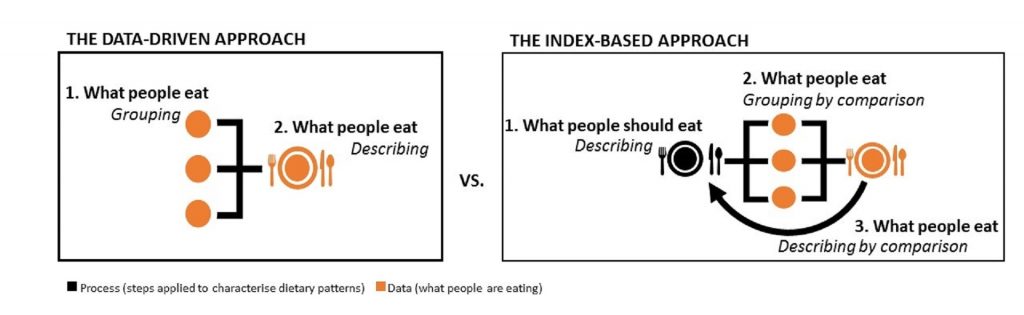
For the purposes of my project, I’m planning to rule out the first approach in favour of the second, index-based approach. We are interested in investigating the alignment of food supplies with an ideal diet across the world, so it will not be sufficient to only describe what people’s diets look like (though see the Links page for a neat piece of work from the National Geographic magazine showing just this). Instead, we need a point of reference from which to compare their relative “healthiness”.
Step 2: Measuring dietary quality
Measures of diet quality differ according to research objectives, notions of what should be considered ‘healthy’ and the data source used. The first reviews of dietary quality indices (DQIs) conducted by Kant (1996; 2004) described three types of indices:
- Variety-based: where scores are assigned according to the variety of foods consumed (within and across food groups) for maximising potential nutrient intake.
- Dietary guidelines-based: where scores are assigned for adherence to dietary recommendations (e.g. FBDGs).
- Mediterranean-diet based: where scores are assigned for adherence to Mediterranean diets.
Warning! The following explanation of how diet quality is measured is served with a hefty bowl of alphabet soup.
The “original” DQIs are the Healthy Eating Index (HEI), Dietary Quality Index (DQI), Healthy Diet Indicator (HDI) and Mediterranean Diet Score (MDS) (Gil et al., 2015). As the development and application of DQIs has increased, these measures are categorised according to their primary units of concern:
- Nutrient-based: diet quality scored on key nutrient intake, using food composition knowledge and tools to convert the amount of certain foods eaten to estimated nutrient intake
- Food/food group-based: scores for adherence to recommended portions, frequencies or number of food groups consumed e.g. Food-Based Quality Index (FBQI), Healthy Food Index (HFI), Food Pyramid Index (FPI), and MDS.
- Mixed/combination indices: scores for balance and variety within and across food groups and macronutrients e.g. original DQI, HEI and HDI (Gil et al., 2015 and Alkerwi, 2014).
The bulk of DQIs come under the third category – which, if you recall from my first blog, makes sense because diversity and balance feature strongly in leading guidance on healthy diets. While new approaches are emerging with indicators such as energy density, antioxidant capacity and inflammatory potential (Alkerwi, 2014).
It is important to note that most DQIs were developed with measuring diet quality using individual dietary collection methods such as 24-hour surveys, food frequency questionnaires and dietary records (Gil et a., 2015). Our study, on the other hand, will be using national food supply data as representative of individual diets on a per capita level. So, I will be looking primarily at the adaptation potential of DQI approaches that can be applied at a food-group level, rather than those that seek to estimate nutrient intake. There are many limitations to estimates of nutrient intake from records of food consumption (e.g. individual metabolism, food preparation practices, foods actually eaten vs that purchased and thrown out) which can be more easily controlled for in methods applied at an individual level.
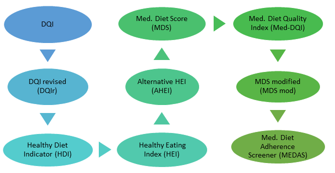
As good a starting point as any, I am looking at Gil et al.’s (2015) Top 9 “most useful” DQIs for measuring diet quality (shown in the image above), despite the authors’ lack of explanation for why these DQIs were considered the most useful.
All of the these DQIs include indicators for food groups and nutrients to different extents. For instance, the Med DQIs include ratios of monounsaturated fats (i.e. olive oil) to saturated fats (e.g. whole milk dairy or fatty meats) while the original and revised DQI have indicators for protein, cholesterol, sodium and calcium which are more difficult to convert to food supply data (Gil et al, 2015).
Over the next couple of weeks I will looking more closely at these issues in our study design. But for now I’m going to see if I can find some alphabet noodles in Cali’s supermercados…
-A.
P.S. I actually found a delicious looking recipe on the ‘My Colombian Recipes’ blog and for the author at least, sopa de letras con carne (alphabet soup) was a family favourite!