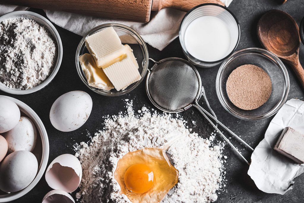
Here’s a challenge for the kitchen, and my fledgling wordsmithery: what would you make if you wanted to blend a bunch of ingredients together, but then be able to take them out again?
I am posed with a similar challenge, as we score and rank national ‘diets’ across the world for their closeness to dietary ideals. To meet this goal, we are in the thick of shaping data on food supplies, grouping them into more manageable, simpler forms—how many of us have been shaped into seeing what we eat: in food groups like ‘meat’ and ‘veg’. This process is really useful as it allows us to see the whole more clearly, to see trends and patterns, to compare composition and performance, and to tell the story. But while there is power in simplicity, there is also cause for pause (and making sure you don’t throw out the detail). This post is, if you will, a short journey through that pause.
Why aggregate?
At the most basic level, we might go about aggregating information and developing an index that tells us the sum of these parts to help to answer the question: ‘So, what?’
It can also help with the ‘So, what do I do now?!?!’
We are living in a time when we have more access to more information than ever before, and people want to know what they are meant to do with all of it. In sum, it can be pretty overwhelming to make decisions these days. This can affect us in many ways, at an individual and at a global level. And food is on the table at all levels in between.
Personally, I am not great making decisions at the best of times but come with me to a supermarket and you’ll be sorry. When you are trying to pick something nutritious, that you can afford, that is ethical, sustainable, tasty, in the right portion, that you feel like eating, that you feel you should eat more of (or less of), the list goes on and you either end up with nothing that you came to get or end up splurging on some treat to soothe your anxiety. As I’ve discussed in previous posts, the food system is mighty complex, and even more so today with more ingredients, longer supply chains and space between most of the people who eat food and the environments in which they’re grown. It is not only a significant challenge to retain information about where a food comes from, and the way in which it was brought to you, but also how all of this information should be weighed up in the context of the final food and its competitors, and how, and whether you are (or should be) given it.
Hence, our dilemma with aggregating information crops up notably in the food labelling space. A clear example is in so-called ‘front-of-pack nutrition labelling’ (or ‘FoPL’ or ‘FoP’ for those in the biz), which seeks to simplify nutrition information to make it easier for consumers to make healthier choices. The most disruptive FoPL approach to date is Chile’s stop sign warnings for high sugar, saturated fat, calories and sodium which was introduced mid-2016. Other examples are the UK’s traffic light approach to and Australia’s ‘Health Star Rating’.

Australia’s Health Star Rating 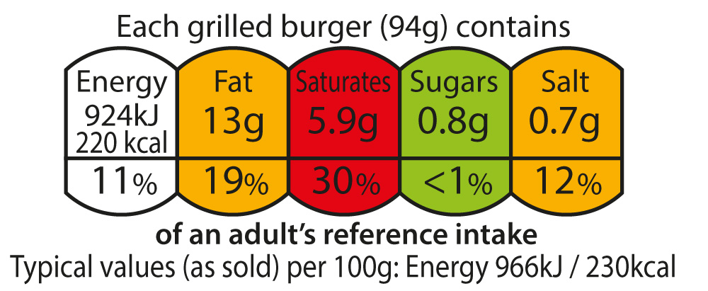
UK ‘Traffic light’ approach to key nutrient content information 
Chile’s ‘Alto en…’ labels
The Health Star Rating adds up the nutritional composition of packaged food items within a category such as breakfast cereal, or fruit juice, and assigns them a star rating (up to 5) according to their relative healthiness in that category. This makes sense because you can’t compare the relative healthiness of say an apple, compared to a muesli bar, because the muesli bar would never win – almost everything in the non-fresh supermarket aisle would always score low and thus reduce the overall usefulness of the rating system.
However, many people have told me that they don’t trust the Health Star Rating because how could a muesli bar have 5 stars in the first place? In part perhaps because the promotional material for the labels simply claimed: ‘the more stars the healthier’. People who don’t understand how the Health Star Rating works, are less likely to make use of it, and as a result of not understanding it, may further doubt their ability to make healthy choices. Essentially though it boils down to trust. And people are less likely to trust and make use of others’ efforts to simplify things for them, if the final product is too simple.
From purchaser to policymaker
If you swap the consumer for a policymaker, and the product is too simple, you might make it easier for the problem and the policy intervention to be oversimplified as well. Plus, if policymakers only base their decisions on oversimplified information or tell the public about it in this way alone, their decision may not be defensible, and trust in their judgement may also be questioned.
From a policy point of view, we may want the ability to measure relative performance (past or projected) across a range of indicators to understand who is the overall ‘winner’ and ‘loser’, be it a player, a country, a type of food, a policy option to pursue. As it was put in the recently released Agribiodiversity Index, this kind of analysis can help to encourage a ‘race to the top’. But if we only see the final ranking, how do we know how the competitors performed as a group? And even if we know that, how do we know what is driving the final score. Is the group in the middle average at everything, or are some of them terrible at some things, and great at others?
So, how do others do it?
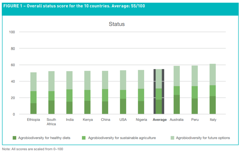
The Agrobiodiversity Index has so far scored 10 countries on their performance for healthy diets, sustainable agriculture and future options. Despite its name, countries are not ‘ranked’ in the sense of who is coming 1st, but their relative performance is (for now at least) shown by bar charts, with scores scaled from 1-100. This approach is then quite directly applying the ‘race to the top’ idea – as this presentation may invite the indexed countries seek to push up ahead of the others towards 100. We can also see that countries are deriving their scores from each of the performance areas in differing proportions. The index report turns to relative performance in a more direct way in its country profiles, where countries are described as ‘low’, ‘medium’, ‘high’, etc. in the text. In general, it appears that this index has pretty much avoided being an index – perhaps in part due to the very concerns that this is post is about. Without context the information can be misportrayed. And particularly with results showing middling performance across all countries assessed, is the risk heightened that Italy, Peru and Australia could pat themselves on the back for ‘leading’ when much more needs to be done? Further, it begs the question whether you can have an index of only 10 countries. It will be great to follow the development of the index in coming years.
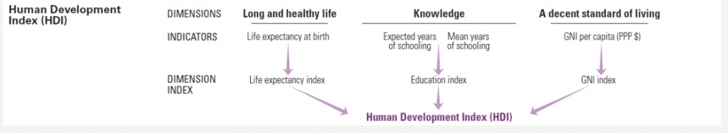
The Human Development Index
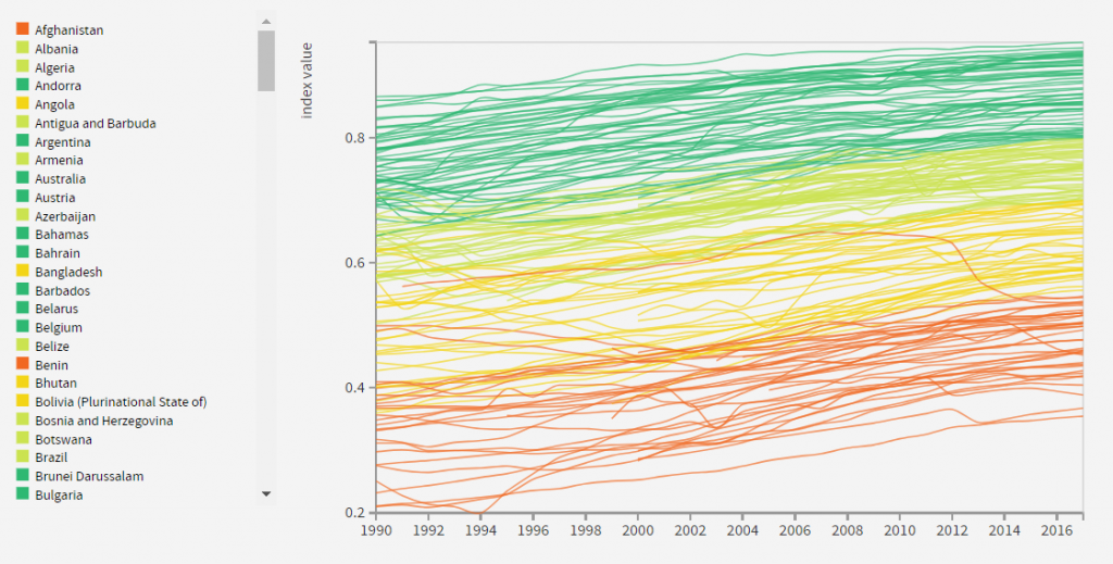
The Human Development Index (HDI) is a much more indexy-index. This is helped by the breadth of coverage of the index, and that it has been monitored annually since the 1990s. As shown in the image above, countries are assigned a score from 0-1, with a colour to indicate their performance (like a traffic light, but 5 colours). The HDI is made up of the following dimensions, indicators and indices and information on each country with available data for the analysis is provided.
Back to diet quality
As I mentioned in earlier posts, while numerous indices of diet quality have been developed for multiple scales from individual, to household, intra-national, national and global, none seem to have been applied at the same scale as the HDI. The work may have been done but hasn’t been published so that individual countries can be ‘zoomed in on’ in a global country-by-country index.
Imamura et al (2015) for instance came very close to this in surveying diet quality of men and women in 187 countries by scoring consumption of 10 more healthy food items, and 7 unhealthy items and these groups combined. This study was very comprehensive – but it essentially considered the quantity of consumption of these food items and item groups separately, it did not assess the quality of the total diet, as made up of these (and other) food items. There are good reasons for this. First, the authors showed that less heterogeneity between countries is revealed by a combined score only (healthy and unhealthy foods together). Across income groups, total scores were fairly middling with means of 48.6-59.9/100 (with scores decreasing as income increases) but were much more disparate between the low- and high-income groups for unhealthy foods (low-income country mean 75.9 and high-income 37.4). And second, changes in consumption of one food group are likely to mean changes in the others (as the size of the total diet is largely consistent), so it is harder to make generalisations at regional or income levels when the total diet, not individual or groups of foods are considered separately.
So, the ‘so what?’ Imamura et al (2015) is perhaps more targeted towards global or regional development and nutrition policy, rather than national. At the national level, the reader (or policymaker) has more work to do to join the dots on where they are performing well, and not so well and where they sit globally altogether.
So, what?
‘So what, yourself?’ you might be asking.

Pulling together a lot of information, trying to make sense of it and communicating it in a form people can understand–in the case of indices, through competition–is useful. But we have to be careful with how we do it, make sure we properly explain how (and why) a score was developed, what it takes into account (and more importantly, what it doesn’t) and provide access to the information used to develop the score. If we don’t do these things, we might end up more confused than we started. And the people we are trying to simplify things aren’t likely to trust our assessment of what they should do with the information we have aggregated for them.
At the end of this pause, I have more respect and sympathy for those who have attempted ranking performance based on a variety of complex indicators. I am also both more convinced of their usefulness, and more wary of how they should be handled. Looking forward to seeing what more I learn as I try to do the same!
Now, back to this baking dilemma… Perhaps some sort of trifle? Hmm.
-A