
Proper Legend Bai
An essential part of scientific writing is to produce figures and tables that can be plucked out of your research and still make sense.
With figures like maps that means you need to include a good legend to show the reader what’s what!
In an ideal world this is easy. But when my computer and I have very different ideas of an informative legend you get chaos and a lot of frustration (and also some awkward moments when a supervisor says it makes no sense 😂).
So enjoy this little insight into my inner monologue while attempting to create good figures for my thesis!
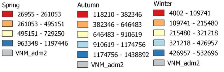
Oh my good god, what is this abomination? Why is there only four colours in Spring? What does VNM_adm2 even mean? These mean nothing to each other for any comparison!
.
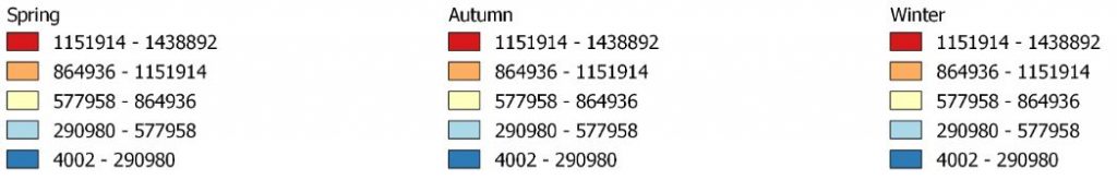
Okay… Better. They’re all on the same scale, yes, good. Why is there three legends with the same information though..? And again what do the numbers mean without any units?
.
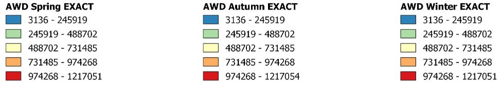
Oh god, you made it worse! Why are the numbers different now..? Oh this is for a different scenario? Well then indicate that. And for god’s sake what are the units?
.
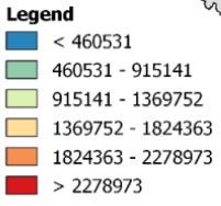
Yes that is in fact a Legend… Not a very original title, maybe come back to that one. Okay numbers are better. But… Where.👏Are.👏The.👏UNITS!?👏👏
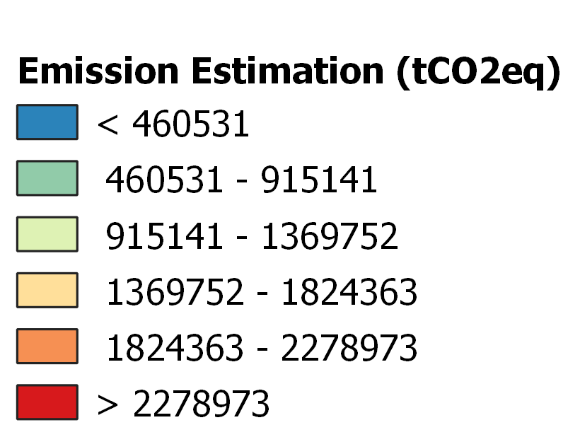
Oh sweet relief this is somewhat better! Got a good title, the scale is the same for all the maps, and there are units (finally!). Might be onto something good here!
.
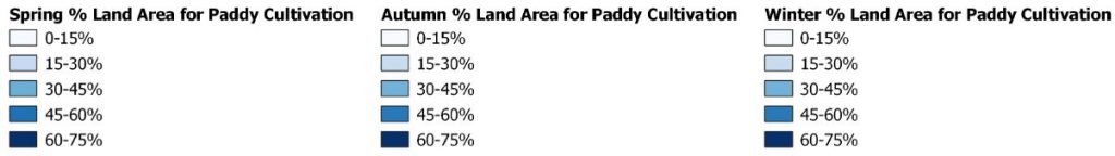
Oh for- Seriously!? What did we say about too many legends with the same information!?
So, yea. Little things like a simple legend can make a big difference to the readability of a thesis. 😅