My data have been gathered and I have been busy collating the results on various spreadsheets, tables, graphs, charts etc.! Have a look at some of these results below!
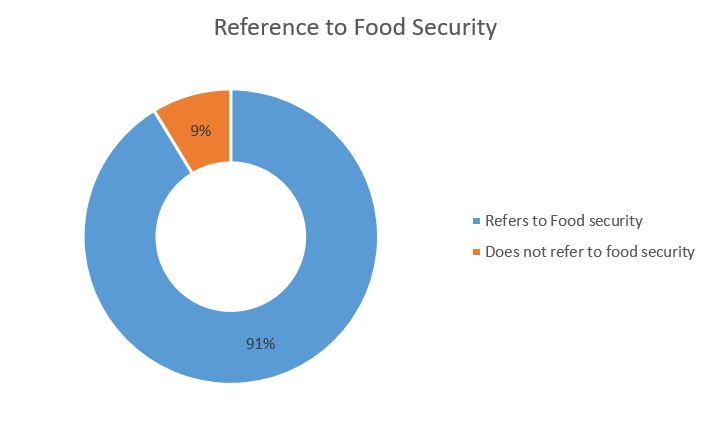
Doughnut chart illustrating the percentage of SSA countries that refer to food security in their INDCs
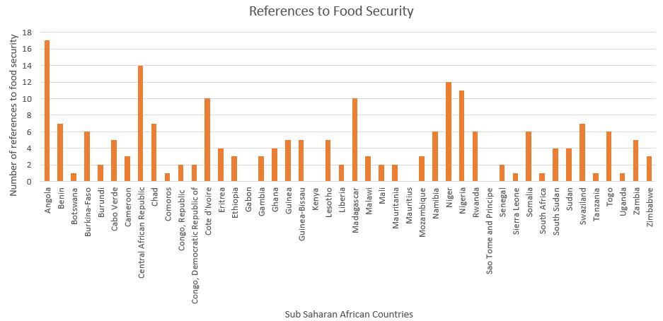
Column chart showing the number of references that each SSA country makes to food security
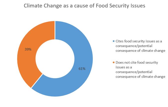
This doughnut chart shows the percentage of countries that cite climate change as a cause or a potential cause of food security issues
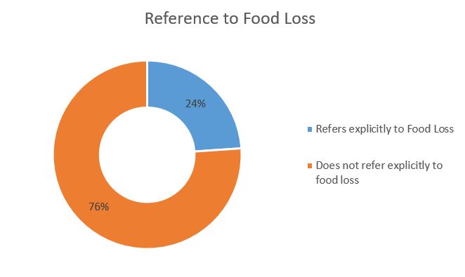
Doughnut chart shows the percentage of countries that refer to food loss in their INDCs
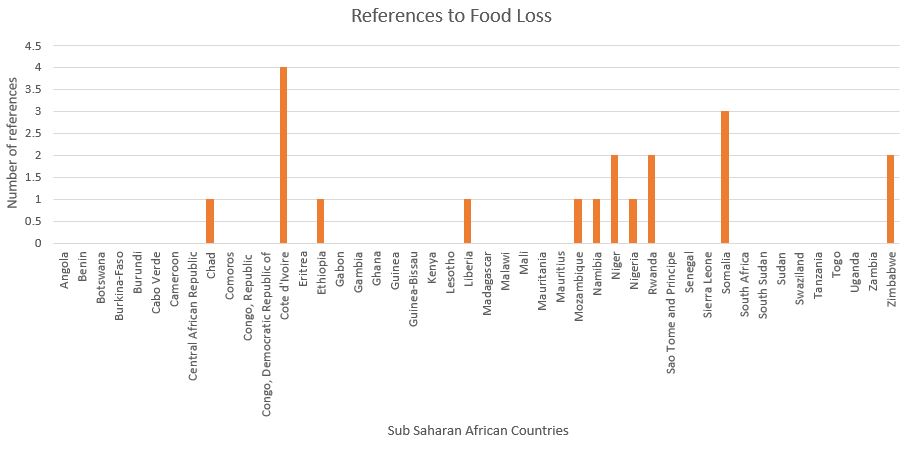
Column chart showing the number of references to food security made by SSA countries in their INDCs
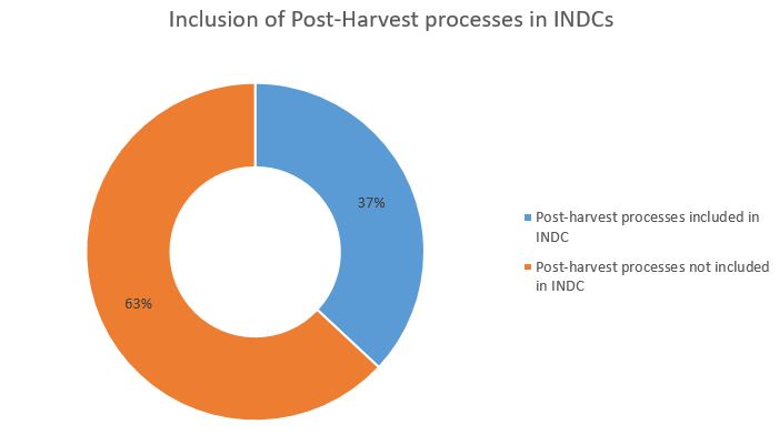
Doughnut chart displaying the percentage of countries in SSA that included post-harvest processes in their INDCs
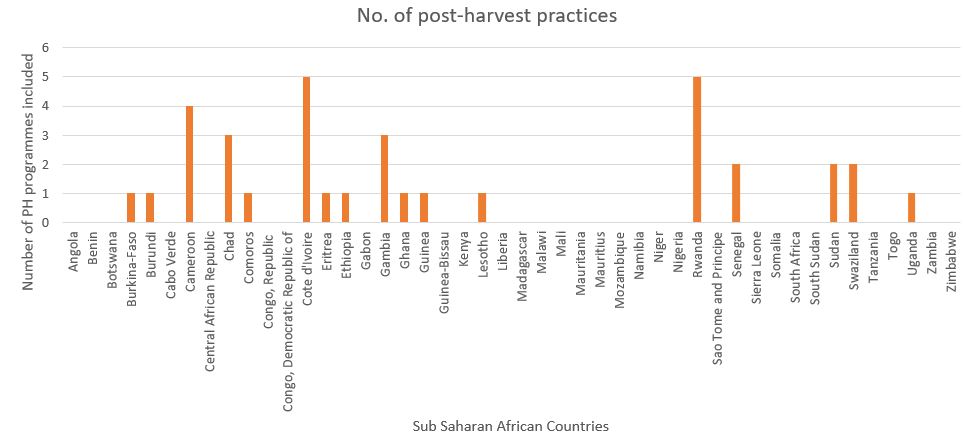
Column chart showing the inclusion of post-harvest processes by SSA countries in their INDCs
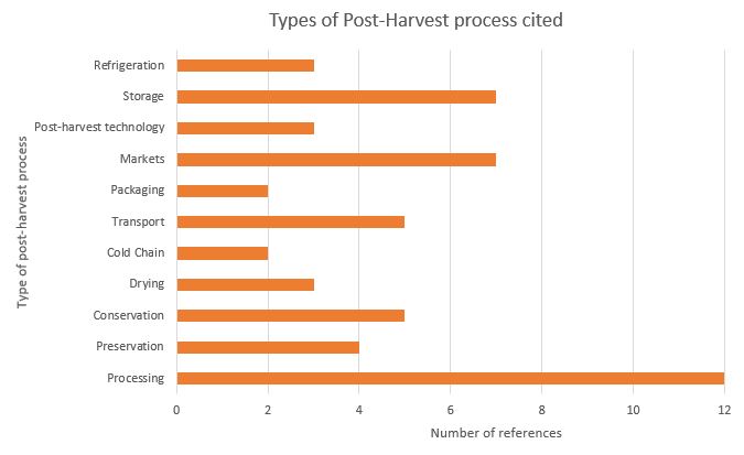
Clustered bar chart giving a breakdown of the type of post-harvest references mentioned in the INDCs